The University launched a new website for students and faculty this spring semester, MySJU. The new site is designed for both the individual student and faculty member throughout the institution.
According to Eric Alvarado, academic technology director, the process of designing a new student and faculty portal has been ongoing since last spring. Alvarado said professors and other faculty members have been kept up-to-date since last spring into the summer and gained official access last October. The new site brings a new light to better branding to the student body and institution as a whole.
“The new website is a true portal,” Alvarado said when talking to the Torch about how the new site brings “enhanced customized and targeted information” that the individual student and faculty member can properly receive.
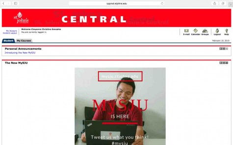
The plan for a new student and faculty portal has been a main goal as a form of rebranding for about a year now, according to Alvarado. There is a lot of content that the University receives and would have liked to place on the old portal, St. John’s Central, which was a single system that did not provide the means of proper promotional purposes.
“One challenge with St. John’s Central was our inability to target specific population of students,” Frank Jerome, technical analyst for the University, said. “Our main advantage for a student using this new system, we are now able to target those channels or blocks of information to specific individuals, specific demographic of students.”
According to Jerome, there were three student focus groups that were held last fall by the university to test the new MySJU website. This was organized for students to compare the likes and dislikes of both the new site, MySJU and the old site, St. John’s Central. The information from the focus groups allowed those working on the new site to have a clearer input on what features to include on the new site. Jerome mentioned the design and aesthetics of the site improved as a result of the feedback.
Screenshot: Cheyanne Gonzales
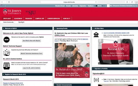
Screenshot: Cheyanne Gonzales
“With MySJU, now the color schemes and the design patterns that we used has that sort of St. John’s branding so once you enter MySJU you feel like you’re still on St. John’s property” Jerome said. “So I think that’s another huge benefit; we will really pay attention to design and we’re still improving it.”
Both Alvarado and Jerome emphasized the importance of the new site’s customization towards both individual students and staff. For example, there’s a channel up on the new site that is only for resident students because it contains resident specific content. With the ability to manage different sites for varying members, the school has created a greater benefit by improving the site.
Since the launch of the new portal, students have used social media, mainly Twitter, to express their different opinions of the new site.
Sophomore Marc Saint-Ulysse thinks the new site is “nice” but believes the old website could have lasted a few more years. Saint-Ulysse said he has struggled to find detailed information for his non-Blackboard affiliated classes, including the roster, and he is unsure if that feature is on the new site. He did mention to the Torch some aspects of the new site that he finds useful.
“I do like how my student e-mail becomes an extra tab to my web browser instead of the Microsoft Outlook box popping up,” Saint-Ulysse said.
“I think that the new MySJU is a good concept overall, but it is way too confusing,” Cecilena Sosa, a Sophomore public relations major said.
“I think it was a bad thing that they didn’t inform students ahead of time because we weren’t prepped on how to navigate it,” Sosa said.
However, other students, such as Sophomore Pritesh Shah, found the new site to be manageable.
“I don’t mind it, it has its ups and downs and just takes a little getting used to, but its not too bad!” Shah said. “You just have to figure it out but it’s pretty much the same.”


