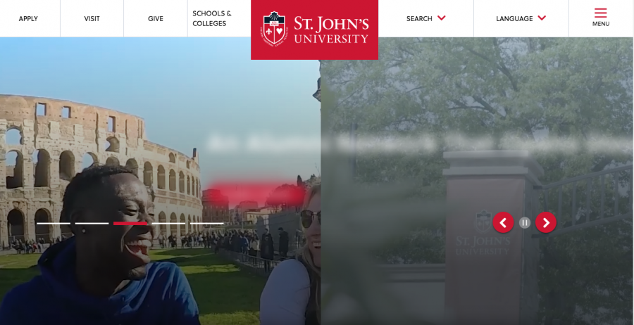
The University has revamped its website, www.stjohns.edu, in an attempt to become more mobile-friendly and accessible to visually impaired students.
“Website design came about for a couple of different reasons,” a spokesperson for the University, Brian Browne, said. “Since the backend content management system was updated, the site needed to be updated.”
The University uses a backend content management system called Drupal, and with yearly updates to the system, they try to keep up by making appropriate changes to the site. This is the first complete makeover for the site in about six years.
The site is also now scales from small to large, as opposed to previously scaling from large to small.
“We wanted to make the site more mobile-friendly and accessible to like visually impaired student,” Browne said, adding that most visitors to the site are prospective students who are viewing the site on their mobile devices.
“Most students start their college searches on their phone,” he said. “Most St. John’s students are using mySJU.”
The website still has the same copy and content, it just has a “much more user friendly experience.”
As most students recall, the old site had visually-pleasing moving images, but when you would click on them, they wouldn’t go anywhere. Now, there’s a more interactive experience.
“This design site creates a call to action,” Browne said. “It’s easier to click to get places.”
The site features two methods of searching: traditional search and an in-guided search. The in-guided search helps visitors better navigate their needs.
“In the in-guided search, there’s a drop-down menu that says ‘I am a… and I’m looking for… take me there,’” Browne said.
The changes to the search are based on an analysis of what visitors are using the site for.
This is only the first version of the site and the University aims to make changes based on user feedback.
Freshman student Catherine Pham likes the new site.
“I think it’s a lot more helpful, everything is easy to access,” she said.
Freshman student Adam Kacperak thinks the website is “super clean.”
“It’s just hard to work,” Kacperak said.
Sara Rodia contributed to this story.


