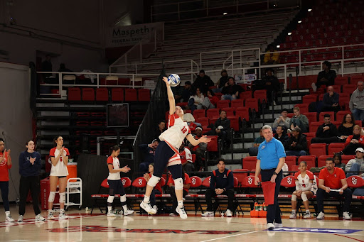
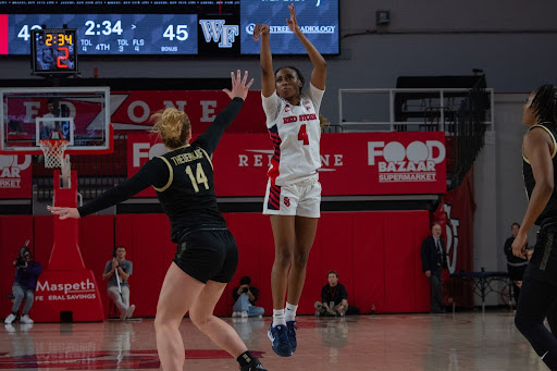
College basketball, through rich tradition and lucrative television deals, has set the stage for clothing brands to become intertwined with individual programs and the successes they find. But beyond this modern symptom of college athletics is the core question of all uniform design: How stylish are they?
St. John’s Basketball has been around for over 100 years. With a storied history and recent partnerships with both Under Armour and Nike, there are many places to look in finding the best basketball jerseys in St. John’s history.
1994-95 Men’s Home Jersey
Few universities can claim to have worn one of the most iconic jerseys in college basketball history. This uniform, immortalized by St. John’s great Felipe López’s Sports Illustrated cover, best signifies the phrase “We Are New York’s Team.” This is most evident in its skyline shorts that fans have been clamoring to see retroed in recent years. While yellow may not be a color that St. John’s faithful are used to seeing today, its presence here matches the logos and branding of Red Storm sports at that time flawlessly.

1985-86 Men’s Away Jersey
Though many of the Mullin, Berry and Jackson years feature a red jersey with navy lettering, a similar version employing a white wordmark instead has served as a template for uniforms, merchandise and branding even today. Basic in nature, this design best encompasses much of the Men’s Basketball program’s historic past while also providing a clean style on the court. The “SJU” on the shorts rounds out the classic look, serving as the icing on the cake for these threads. Bonus points are awarded for the Nike sneakers worn by the team with this uniform, which have since been retroed and sold as the Nike Dunk Low Retro SP “St. John’s.”

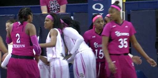
2015-16 Women’s “Play 4 Kay” Jersey
The Women’s Basketball program has done a remarkable job in its endeavors involving breast cancer awareness through annual “Play 4 Kay” events and Pink Zone games. The incorporation of pink into the St. John’s uniform has become a staple of the festivities and it was difficult to choose a favorite among the various iterations. However, this primarily pink jersey best varies from the ladies’ typical threads while meshing very well with its black and white secondary colors, all for a great cause.
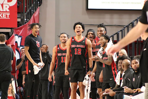
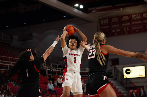
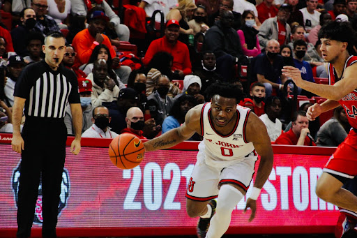
2019-20 Men’s Home Jersey (Current)
Though the wordmark of the Men’s Basketball Program’s uniforms did not change upon reuniting with Nike, a few adjustments to the jersey’s surrounding features did wonders for its look on the court. The name and number fonts, as well as the colors utilized in both, compliment the rest of the jersey extremely well. Additionally, the inclusion of a primarily red stripe along the sides and edges make for a professional look on the Johnnies. The Nike logos, meanwhile, blend in seamlessly in black. In comparison to its counterpart worn on the road, it does a much better job of making the “St. John’s” wordmark on the front and last name on the back stand out. As a modern take on a forever classic, the current home jersey of the Red Storm is one that should stay for a long, long time.
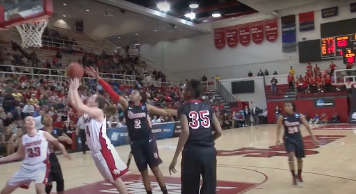
2012-13 Women’s Alternate Jersey
While black is not a primary school color of St. John’s, this jersey serves as a fine example of just how nice it can look on the court. The use of white on the logos and jersey numbers contrasts very well with the uniform’s dark base. The numbers also include a shadow effect, something that has not been featured on a Red Storm Basketball uniform since that season. To wrap it up nicely, players primarily wore all black accessories with the uniform to fully complete this blacked out look. All of this, along with the red designs along the sides, make for one of St. John’s Basketball’s more unique uniform concepts that I hope to see return in some way moving forward. I suppose one can dream.
